
Reluma
Designing for Real-Time Stress Reduction
Client: A wellness initiative by The Daily Health Conference, a global non-profit organization aiming to expand its digital offering and re-engage users through mobile-first experiences.
Goal: To design a mobile experience that helps users reduce stress in real-time through simple, accessible, and effective interventions.
Duration
2 weeks
Team
Fátima Abel (UX/UI Designer) and Nouran Mansour (UX/UI Designer)
Skills
UX Research
UX Strategy
UI Design
Information Architecture
Branding
Tools
Figma
FigJam
Stark
Google Forms
Claude
Gemini
Hand Sketches
Figr
The Impact
Clarity of instructions across the tested core flows.
Perceived immediate relief after first interaction
Preference for voice-assisted guidance in high-stress scenarios
The Problem
Stress doesn’t wait—and neither do users.
Existing solutions require time, effort, and motivation users simply don’t have in high-stress moments.
The Solution
Reluma delivers guided and AI personalised micro-interventions (3–5 minutes) with voice and touch interactions, helping users regulate stress instantly without cognitive overload.
The Process
Discover
Market Research
Brand & Features Comparison Charts. Market Positioning Map.
The wellness space is highly saturated, yet most products converge around the same model: content-heavy, self-directed experiences.
Through feature comparison, brand analysis, and positioning mapping, I identified three key gaps:
Products rely on exploration instead of guidance
Experiences are built for calm moments, not stressful ones
Users are expected to choose before they are able to think clearly
Opportunity:
Reframe stress management from a content consumption problem to an interaction design problem—focusing on immediacy, clarity, and action.

User Research
Quantitative Data: Interviews
We conducted 5 in-depth interviews to young professionals between 27 to 43 years old (Érika 27, Rana 30, Andy 33, Rodrigo 35, Irene 38 and Karen 43) to understand deeper their experiences during stressful moments.
Some key patterns flourished:
Users want to be told what to do, not explore options
Stress appears in short, high-intensity moments
Overthinking creates decision paralysis loops
Existing apps feel like effort or obligation
Strong openness to voice when overwhelmed
Preference for quick, structured interventions (3–5 min)

Quantitative Data: Survey
When we analyzed the 71 survey responses, a clear pattern started to emerge. Stress wasn’t occasional—it was embedded in people’s daily routines. In fact, 80% of participants reported feeling stressed primarily due to work or studies, revealing that stress is less about isolated moments and more about a constant background state.
But what was even more telling was how users wanted to deal with it. 69% expressed a preference for personalized guidance, indicating that generic solutions were no longer enough. Users weren’t just looking for tools—they were looking for direction. This was reinforced by the fact that 66% valued short, guided exercises, favoring structured support over open-ended exploration.
Time, however, quickly surfaced as the biggest constraint. Nearly half of users (44%) could only dedicate 5–10 minutes, while another 27% had less than 5 minutes. This reframed the problem entirely: even the best solution would fail if it required too much time or effort.
This led to a key insight: users don’t need more features or complexity.
They need immediate, simple, and highly directive support that fits seamlessly into the limited time they actually have.

Define
Affinity Diagram
Synthesizing research revealed a critical shift:
→ The problem is not lack of tools, but too much cognitive demand at the wrong moment.
Key themes:
Immediate action > reflection
Guidance > choice
Simplicity > feature richness

User Persona
To bring our insights to life, we translated the patterns from the affinity diagram into a persona that reflects a recurring user profile.
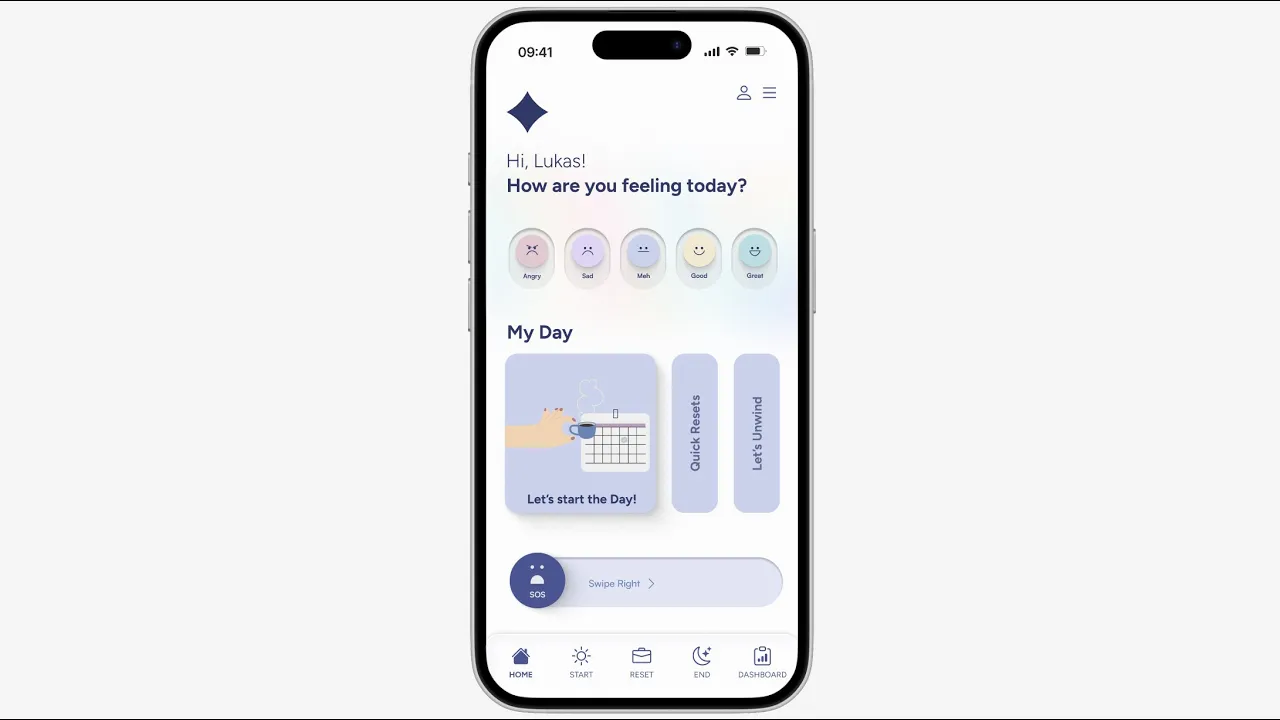
Meet Lukas Fischer (31), a Product Manager based in Berlin. Lukas represents a group of high-performing professionals who operate under constant cognitive load—always “on,” always making decisions, and rarely switching off.
For Lukas, stress isn’t just about workload—it’s about mental saturation. His ambition is clear: he wants to perform at a high level without burning out. He’s not looking to slow down, but to regain clarity, focus, and a sense of control over his day. Efficiency matters to him. He gravitates toward minimal, frictionless experiences, and feels motivated when he can see tangible progress, even in small steps.

However, his reality tells a different story. His day is fragmented by continuous notifications, back-to-back decisions, and little room to disconnect. This leaves him feeling mentally drained and overwhelmed, even outside of work hours.
What Lukas truly needs isn’t another tool or feature—it’s relief without effort. He looks for solutions that tell him exactly what to do, without requiring additional thinking. Ideally, these interventions fit seamlessly into 3–5 minute windows, allowing him to reset quickly and get back on track

User Journey Map
To better understand Lukas’ experience, we mapped his day end-to-end. What emerged wasn’t a single stress point, but a series of small breakdowns tied to everyday moments.
From the moment he wakes up, the pressure is already there. After a poor night’s sleep, he starts thinking about his KPIs and personal commitments. On his commute, he checks 15+ emails and 30 Slack notifications, which quickly builds anticipatory anxiety before the day has even begun.
As the day progresses, the intensity increases. He runs his stand-up, prepares for a meeting with his boss, and tries to stay on top of shifting priorities. But constant interruptions and context-switching push him into cognitive overload, especially when his work is suddenly redirected for the next weeks.
By the end of the day, although physically tired, his mind remains active. At home, he replays unfinished tasks and upcoming responsibilities, falling into overthinking loops instead of properly disconnecting.
What this journey revealed is key:
Stress isn’t a single moment—it’s continuous and cumulative.
This means the solution must be contextual and easy to engage with in the moment, supporting Lukas in real moments throughout his day—without adding friction.

Problem Statement
Keeping all these scenario in mind, we drafted the following problem statement:

Ideation
How Might We…
We translated insights into three strategic directions focused on real-time intervention, cognitive load reduction, and habit sustainability by answering these three "How Might We" questions.

Three Directions & Crazy 8's

Develop
Moscow Method
I used MoSCoW prioritization to strip the product down to what truly matters: immediate value in moments of stress.
This ensured we didn’t dilute the experience with non-essential features.

Minimum Viable Product (MVP)
The MVP was defined around a single promise:
👉 Help users reduce stress in under 5 minutes, with zero friction.
Everything else was deprioritized.

User Flow
The flow was intentionally linear and directive:
Express state → Receive guidance → Complete action
Users don’t navigate—they are guided step-by-step, eliminating hesitation.

Site Map
The structure is built around moments, not features:
Start (Morning)
Reset (Mid-day at work)
End (Evening)
Panic Button (Cases of special high stress)
Dashboard
This aligns the product with real-life behavioral patterns.

Iterate
Low-Fidelity Sketches & Concept Testing
Once we understood the problem space, we moved quickly into low-fidelity sketches to explore potential solutions and test them early.
Rather than investing time in polished designs, we focused on speed and learning—creating simple flows that we could validate through rapid testing. This allowed us to observe how users interacted with the experience before committing to a direction.

What we discovered in the concepts tests was clear: users didn’t struggle with understanding the product—they struggled with deciding what to do.
Too many options created hesitation. Informational screens added friction. Even small amounts of text slowed them down.
These insights directly shaped the changes we implemented in our next Mid-Fidelity iteration:
Removed unnecessary options to reduce hesitation
Strengthened primary CTA (“Let's start the day!”)
Shifted from informational screens → guided flows
Reduced text in favor of action-based interaction
Simplified entry into the experience
The goal was simple: reduce thinking, and make the next step feel obvious.
Mid-Fidelity Wireframes & Usability Testing
With a clearer direction in place, we moved into mid-fidelity prototypes to validate usability in a more realistic context.

At this stage, the focus shifted from what the solution is to how it feels to use it. We tested the experience around three key dimensions: speed, clarity, and emotional response—observing not only whether users could complete tasks, but how effortlessly and confidently they moved through them.
What surfaced was subtle but critical. Even when the flow worked, small frictions—extra steps, unclear wording, or too many visual elements—slowed users down and disrupted the sense of calm we were aiming to create.
These insights guided the refinement towards high-fidelity:
We reduced navigation complexity and visual clutter, making each screen easier to process at a glance.
We refined the wording shifting from abstract language to more direct, actionable guidance: start, reset, end.
Flows were shortened to improve completion rates
Clearer progress and feedback cues were added to help users feel oriented and in control.
We balanced voice vs touch entry depending on context, whether users needed a hands-free moment or a quick, discreet interaction.
Brand Attributes, Moodboard & Style Tile
With the core experience defined, we focused on shaping how Reluma should feel.
We defined the brand around five key attributes: gentle, relaxing, personal, friendly and human—intentionally avoiding anything that could add visual or cognitive overload. The moodboard and style explorations helped us align on a direction that felt soft, reassuring, and unobtrusive, reinforcing the idea of relief rather than stimulation.

From there, we translated these principles into a scalable design system in Figma, ensuring that every design decision remained consistent as the product evolved. I contributed to building a foundation that included:
Text and color styles
Text and color styles.
A reusable component library (buttons, inputs, navigation)
Icon set and illustration system
Spacing and grid rules, to mantain visual rhythm and clarity across the screens.
This system wasn’t just about consistency—it was about intention. Every element was designed to reduce cognitive load, so that interacting with Reluma feels simple, calm, and effortless in moments when users need it most.

High-Fidelity Prototype & Last Testing
At this point, the focus expanded beyond usability to the overall quality of the experience. We wanted to ensure that Reluma didn’t only work well, but felt right in moments of stress. This is how we polished our high fidelity screens for the final prototype of these two weeks.

We conducted accessibility testing using the Stark Figma plugin. We focused on readability, contrast, and overall cognitive load to guarantee the interface remained easy to process under pressure. We did some amendments to text sizes and color contrast.
In parallel, desirability testing , ran with the "Mircrosoft Reaction Cards" and with the "Brand Personality Test", helped us understand how users perceived the product emotionally—whether it felt trustworthy, calming, and supportive. Finally, we ran a last round of usability validation to confirm that flows were seamless and required minimal effort.
Final Thoughts
Back to top