
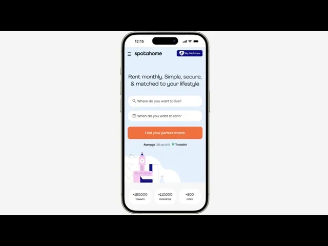
Spotahome
Lifestyle Matching Tool
Client: Spotahome is one of Europe's leading online rental marketplaces for mid to long-term stays. It connects tenants & landlords, and allow users to book verified homes online. Lara Mateos, PM of Spotahome, was the direct contact.
Goal: To rethink the rental journey for Gen Z users by integrating AI features to create smarter ways to discover, compare & confidently chose homes remotely.
Duration
2 weeks
Team
Fátima Abel (UX/UI Designer) and Jimena Cadena (UX/UI Designer)
Skills
UX Research
UX Strategy
UI Design
Information Architecture
Business Design
Tools
Figma
FigJam
Google Forms
Claude
Figma Make
Hand Sketches
Stark
Figr
The Impact
More successful matches
Faster onboarding time
Time to find a flat
The Problem
Gen Z renters moving abroad for mid-term stays struggle to confidently choose housing because current platforms lack transparent and reliable information on property quality and true costs. And mainly they ignore completly the lifestyle compatibility fit.
The Solution
The new features will allow users to search for temporary accommodation that matches their lifestyle. Based on a guided onboarding profile, each listing shows how well it matches the tenant across budget, distance to university, transport, amenities, and flatmate compatibility, expressed as a percentage breakdown.
The Process
Discover
Market Research
Brand Comparison Chart
As start, we elaborated a comparative analysis of how key rental platforms position trust, transparency, and user experience. This helped us to identify how Spotahome could evolve its brand to better resonate with Gen Z expectations.

Feature Comparison Chart
We mapped a breakdown of key features across competitors to understand gaps in the current rental experience. The focus was on identifying opportunities to reduce friction and support better decision-making.

Market Positioning Map
We drafted a positioning map mapping competitors across trust (verification level) and booking friction. This revealed a clear gap between high-trust platforms and seamless user experiences.

Main Opportunities
Turn trust into features that reflect transparency.
Use AI matching & conversational search to simplify discovery.
Introduce comparison & affordability tools to accelerate decisions.
User Research
Desk Research
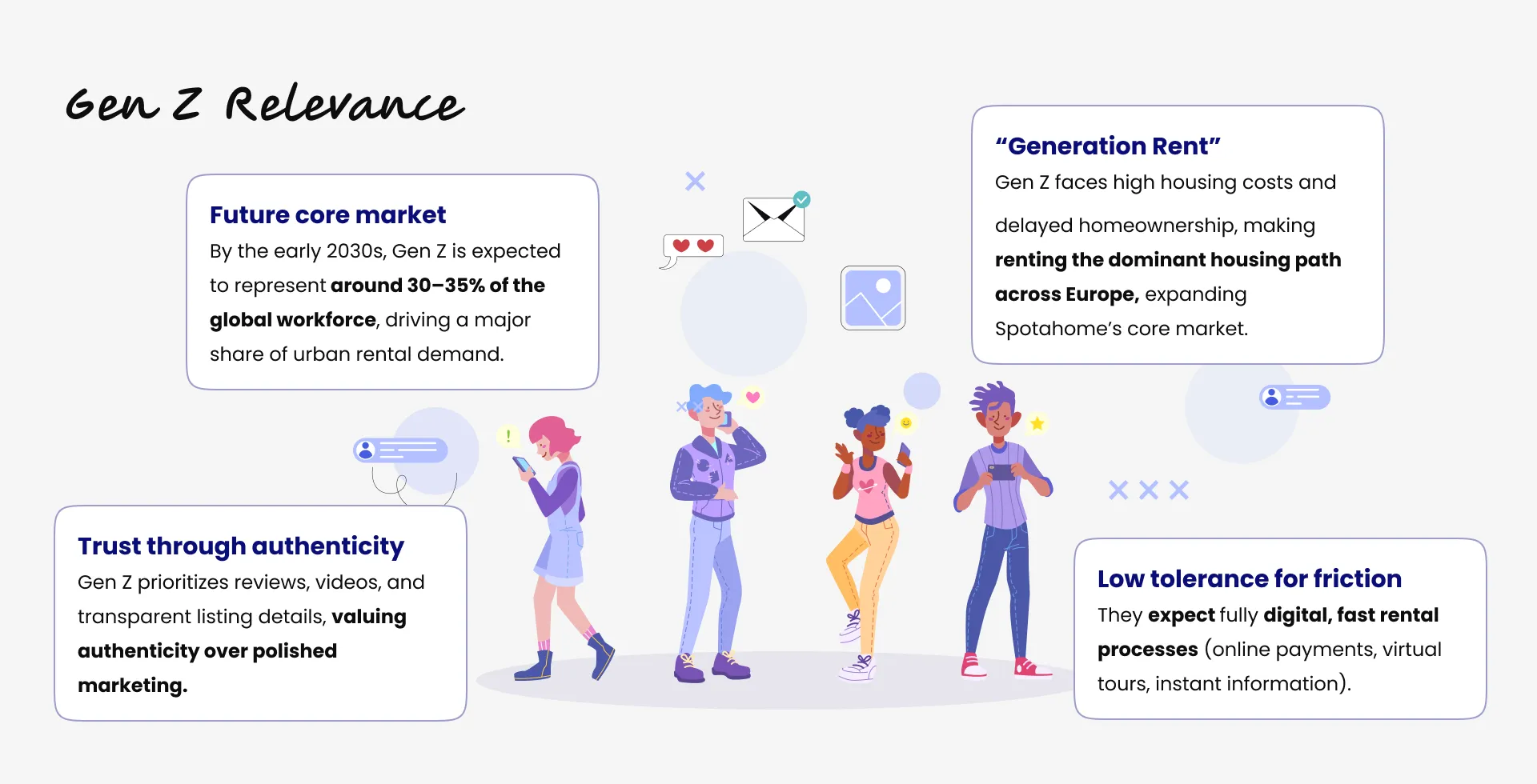
We started by doing a quick desk research to understand deeper the behavioural patterns of the Gen Z users. Appart from reassuring with figures that they are the future core rental market, we understood how for them the trust through authenticity is a must, or how they have a very low tolerance for friction, also how they are considered the "Generation Rent" which is significative for Spotahome.
Qualitative Data: Interviews
We conducted 5 in-depth interviews with Gen Z users (Coty 29, Paola 21, Maga 25, David 21, and Daniel 24) to understand their experience renting remotely.
The insights revealed a strong need for trust in the data provided, flatmate compatibility information, and more personalized and guided decision-making support.

Quantitative Data: Survey
To validate patterns at scale, we gathered 115 responses, mostly Gen Z users, confirming key behaviors and expectations.
Results highlighted that lifestyle matching is a major concern, especially when living with stragers. Also, that comparing listings is difficult and time-consuming, with almost half of replies wanting AI-comparisson tools. Users also expressed that they want more clear information about distance to university, work, transport and house rules.

*AI Use: I helped myself to draft a first version of the interview script and the survey questions with Claude. Then I applied my own criteria, reviewed them, modified some questions, introduced new ones. But having that first base to work over accelarated my process.
Define
Affinity Diagram
To synthesize our user interviews we created an affinity diagram. First we extracted the most important insights and quotes from each interviewee. And then we cathegorized all of them in 5 wider groups based on common underlying themes. This helped us to understand which were the concerns that resonated the most and led us to envision our persona.

*AI Use: Instead of spending hours decinding where to move sticking notes, I used Claude to cluster raw quotes into themes. That synthesis fed directly into my Affinity Diagram - What would have taken full day, took about 2 hours.
User Persona
Having all this fresh and digested research information in mind, I co-created Chiara, our primary user persona: A 21st years old university student from Milan looking for an accomodation in Barcelona for her Erasmus program of 6 months. She must find a room in just four weeks, completely remotely, with a limited budget and without knowing her future flatmates. Her main goals are trust, transparency and lifestyle fit.

Chiara faces several frustrations: Lack of information about flatmates, hidden costs, outdated listing pictures, and the difficulty of comparing multiple options. What she needs is lifestyle compatibility info, easier tools and verified information.

User Journey Map
To understand deeper the pain points of Chiara's searching experience, I drafted this user journey. Unvealing and analyzing which were the most difficult moments of her process, clarified directly which were the areas of opportunities to improve the Spotahome experience. This was truly enlighting.
Let's follow Chiara through her rental journey: First, she receives her Erasmus confirmation, she feels excited and celebrates. She starts searching options online, but time is tight. And soon difficulties appear: Information is incomplete, prices are unclear and she fears scams. Because of the pressures she commits to a rushed option, even though she is not fully confident. She arrives to Barcelona, she finally sees the real flat and discovers issues that were not visible online. After a while, she also realizes her lifestyle mismatches hugely from the one of her flatmates, which makes her time in Barcelona uncomfortable and frustrating.

Problem Statement
After a couple of trials and debate, we polished this problem statement in this way:

Ideation
How Might We…
We started the ideation process by brainstorming plenty of solution features that would answer the following three HMW questions.

Three Directions & Crazy 8's


*AI Use: After the brainstoring time, I used Claude to run by itself also a round of fresh ideas answering the 3 HMW questions.The goal was to double check if there was something I hadn't come up with and complement/enrich our long list of feature solutions.
Develop
Moscow Method
Following this decision of the "Lifestyle Match" direction, we continued our process by portraying a Moscow map. This helped us to prioritize the features we first must start working on. See below a picture of it with the Crazy'8 drawings on each area.

Minimum Viable Product (MVP)
After some discussion and shared thoughts we came to this MVP definition:

User Flow
And we captured in a user flow diagram what we thought it should be the process for our users in our new proposed life matching feature when looking for a temporary accomodation remotely.

Iterate
Low-Fidelity Sketches & Concept Testing
After having clear which "happy path" user flow we will follow, I sketched the first key screens to reflect how the interactions will visualize. The design was not UI polished at all, but with those screens I created a first low-fidelity prototype that we used to run three concept tests, from which I got very rich learnings.

From the concept testing we learned straight forward the first amendments we needed to do:
Home Page
To add an entry point to the macthing area on the top nav-bar. I did it with an icon of a sparkling key lock hole wrapped in an heart.
To remove the original CTA "Search for rentals" button, and unify it into just one: "Find your perfect match". Having two was generating confusion.
Onboarding
To shorten the entire porcess. Users felt it quite long and overloaded. So the intermediate screens that shown the steps map of the onboarding being accomplished were removed. We replaced them with a subtle top breadcrumb shown permanently at every step.
To add some data that was missing, like "languages" options or "social vibe".
To include the option of "Access the camera rol" , next to the "Create from selfie" and "Create manually", in the avatar creation page, as users wanted to use the best picture of themselves to create it.
Comparison area:
To add the thrid option of the "Map" , next to "Explore" and "Compare", on the top tab options. Users were constantly asking for it.
To add the exact monthly price of the accomodation to the "Explore" cards, and highlighted in a place that could stand out.
To add a CTA button "Find out more" in the "Explore cards, while just keeping three most important highlight of the property on it.
Property profile
To add pop-ups with more detailed info to the four categories (Distance to university, house rules, flatmates & budget) of the compatibility percentages.
To add a CTA button to unveil real identity to flatmates when they like the property.
To add the AI generated video of "one day living in that property" customised to the user profile.
Mid-Fidelity Wireframes & Usability Testing
While implementing the changes we jumped directly to Figma. There we started to draw the mid-fidelity screens of the entire user flow again. We started refining the layout and the hierarchy: we stablished the same grid that Spotahome uses, we created the first text styles with the Avenir and Poppins fonts used by them, and we also analyzed the type of buttons and icons they have to start creating the first components following their rules.
Once we had this second round of screens ready, I connected them to creat our mid-fidelity prototype. We used it to run three usability tests.

The usability testing was very revealing again. We spotted quickly the second round of changes we needed to incorporate for the next round:
Hope page
To make more clear the entry point to the matching area on the top+nav bar. I converted it into a tag with the name "My Matches" next to the previous icon.
To add a brief explanation of how the matching process works. I explained in three steps: "Input your matching preferences", "Create your avatar to protect your privacy" and "Find a match, connect & unveil your identity"
Search page
To keep the traditional search in the second page as usual, and to add a top highlighted banner on the top of it witha catching phrase and a CTA button to start matching.
Onboarding
To add a short animated explanation of the steps before filling the data. This will reduce friction and increase engagement, by clarifying the value and helping users to understand what they are doing in an enjoyable way.
To add a reference word to each step in the top breadcrumb.
To place the CTA button in the video page at the bottom, so users read all the info of the page.
To add backward buttons on the top left, so users can come back to previous steps and modify them if needed.
Comparison area
To add the dual comparison tool.
To incorporate the "Edit search" and "Favourites" options in the top nav-bar of the matching area.
Property profile page
To include the "Contact" flatmates option through a chat (Just after unvealing the identity)
To synthethize the property info through ratings reflected in simple bars and not rounded percentages graphs. This decision made them more visually simple, and reduced the graphic overload.
Brand Attributes
Spotahome's current visual identity communicates clarity, honesty and fun, supporting its mission to help people find a new home and start a new chapter.
As a base we replicated the original desing system in Figma: color and text styles, iconography, CTA, tab and chip button componets, spacings and grids.

*AI Use: I used the plug-in "Figr Identity" to create the text and color styles. This AI feature really speeds up this traditional repetitive task of generating Design System styles in Figma.
But as our focus were Gen Z users for the new lifestyle matching experience, we transformed the visual laguage by adding "sticker style" and avatars illustrations to adapt to their language, just through the screens of the new feature, while keeping the existing visual identity in the "traditional" search mode.
This decision was taken following a common branding practice of adapting the tone to the audience. We noticed Apple did the same during their latests social media campaigns: they maintained a polished style on Instagram directly connected to their "classic" merchandise for millenials, Gen X and baby boomers; while they used a more palyful tone on TikTok to promote their new "Neo" line for Gen Z users.

*AI Use: I used Chat GPT and Midjourney to generate the stickers visuals.
High-Fidelity Prototype & Last Testing
And finally, we drafted our high-fidelity screens on the third iteration, from which we managed two run to final usabilty tests and polish minor tweaks.

Final Thoughts
What I learned:
1. Trust is not a feature — it’s a system
Verification, transparency, and social proof must work together.
2. Gen Z expects guidance, not effort
They don’t want to search — they want curated, relevant options.
3. UX is about reducing cognitive load
Comparison, summaries, and AI insights are not “nice to have” — they’re essential.
4. AI accelerates judgment, it doesn't replace it
Using Claude for research synthesis and Figma Make for rapid prototyping compressed days of work into hours. But every output still needed a designer to decide what was right for the user — speed only matters if you're moving in the right direction.
Next steps:
Expand conversational AI (chat + voice onboarding)
Explore real-time verification & gamification
Introduce collaborative decision flows (friends, parents, flatmates)
Final Reflection:
This project pushed me to think beyond screens. It was about designing:
Trust in a remote experience
Confidence in decision-making
And a product that truly understands users — not just their filters, but their lifestyle.
Working on a challenge connected to Spotahome allowed me to approach this with a real product mindset — balancing user needs, business context, and scalable design decisions.
Back to top